Russia’s third-largest copper producer, Russian Copper Company (RCC), is a force to be reckoned with. However, even with two of the world’s largest mining projects, the company was virtually unknown outside the Ural region. Behind this lack of recognition was an inconsistent corporate identity; RCC was operating 10 different enterprises under 10 different identities. If it wanted to increase its visibility, it needed to consolidate its operations under one brand.
Landor recognized that RCC embraced modern Russia’s new spirit of savvy, patriotic, and highly competitive entrepreneurship. From this insight, we crafted the Brand Driver Capably smart. Brand values including resourcefulness, agility, and ambition reflect RCC’s vision of being the most intelligent and well-run copper company in the world. Fierce Russian pride was central to RCC’s differentiation, and Landor created a brand story that drew on its values and strategic vision to position the company as an industry pioneer with a distinctively Russian flavor.
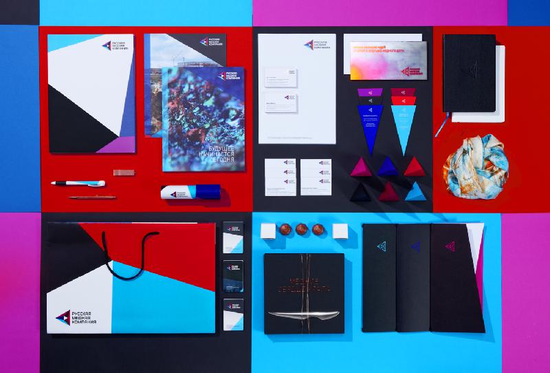
We developed a brand architecture and nomenclature system to tie the parent brand to its subsidiaries. Group-level operations used the full company name, Russian Copper Company (–усска€ медна€ компани€), while individual sites adopted RCC (PMK) as an umbrella brand under which they retained their original name.
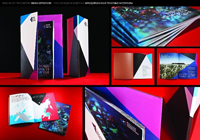
RCC’s kaleidoscopic identity, focused on a central white triangle, represents the company’s concentration on smart mining. The color palette combines the red, white, and blue of the Russian flag with hues of copper. The visual system was applied to marketing materials, stationery, and promotional items.
Immersive environments and trade shows introduced the RCC brand to the world. At the Innoprom Industrial Trade Fair and the Russia-Kazakhstan Forum, RCC impressed visitors with an augmented-reality mine exhibit.
RCC is now commanding the attention that this innovative company deserves. Its strategic positioning, unified identity, and standout product have transformed the brand from confused and invisible to modern and confident. Landor’s design for the Copper Bible, a one-of-a-kind executive gift, won gold at the Moscow International Festival of Advertising and Marketing (Red Apple), special mention from the German Design Awards, and gold in the WPPed Cream Awards.